Posted by Dave Bull at 4:49 AM, May 9, 2011 [Permalink]
Apologies to those who wanted to watch a 'replay' of this morning's Woodblock Webcam session - proofing Mystique print #13. In the kerfuffle of getting the new microphone set up and balanced properly, I neglected to hit the 'Record' button, so when it came time to turn it off an hour or so later, found that it had been off all along ... But there will be many more chances to come, and in any case, the proofing on this print wasn't much to see - mostly a simple registration test really ...
As I mentioned during the session, the main question with this image is which of two very different approaches to take with the colour mixing.
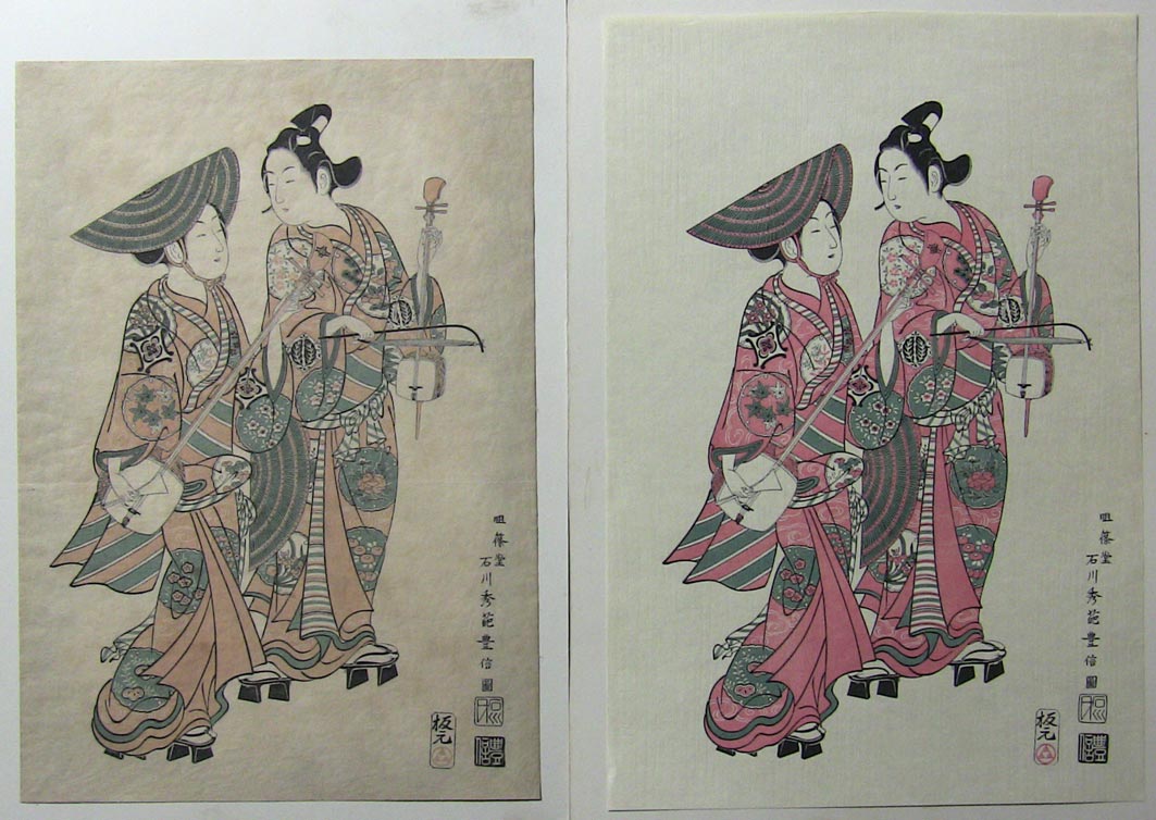
Have a look at these two prints (these images are all clickable) - on the left is a version of the Toyonobu print issued by the Takamizawa Company, sometime in the pre-war period (1920s ?), and on the right is one published by the Adachi Company, post-war (late 70s I would guess):
Now I don't have a decent image of the original for comparison, but here are two other benizuri-e (originals), both by the same designer, and both issued by the same publisher, in the same era. And one of them is even of the same two kabuki actors in the same scene from the same play (although with them seated instead of strolling):
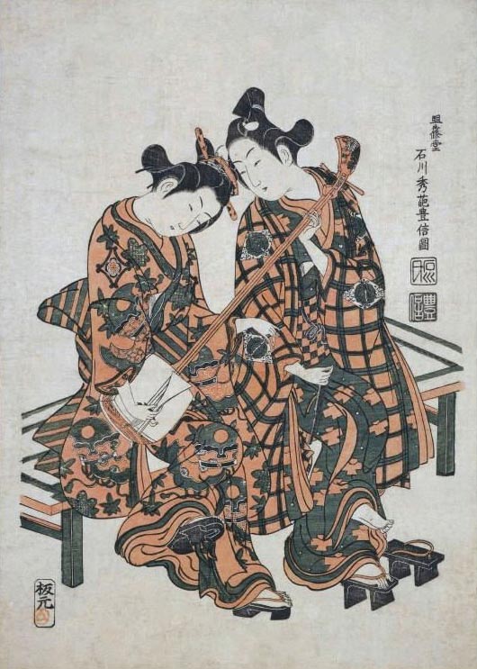

As you can see, there was no 'standardization' of the tones and tints used for the two colours. And indeed, the word beni here is obviously being used in a general sense, and not with particular reference to the substance itself (the actual rose/red pigment used for makeup, kimono dyeing, etc.), because neither of these seems to have used it.
I think all this leaves me with a pretty free hand to basically do whatever I want here, without stepping on anybody's toes. So let's look back at the two reproductions, and consider the different approach that the two publishers have taken.
Although it seems to have been different in the pre-war period, Adachi's 'policy' in modern times has been clear - make prints that are as close in appearance as possible to what the original would have looked like at the moment of original publication. Bright unfaded colours; crisp white paper.
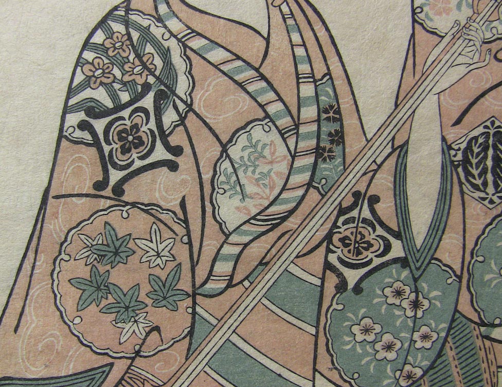
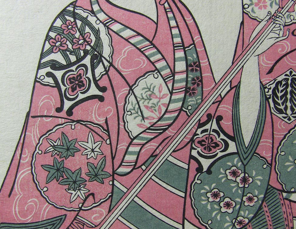
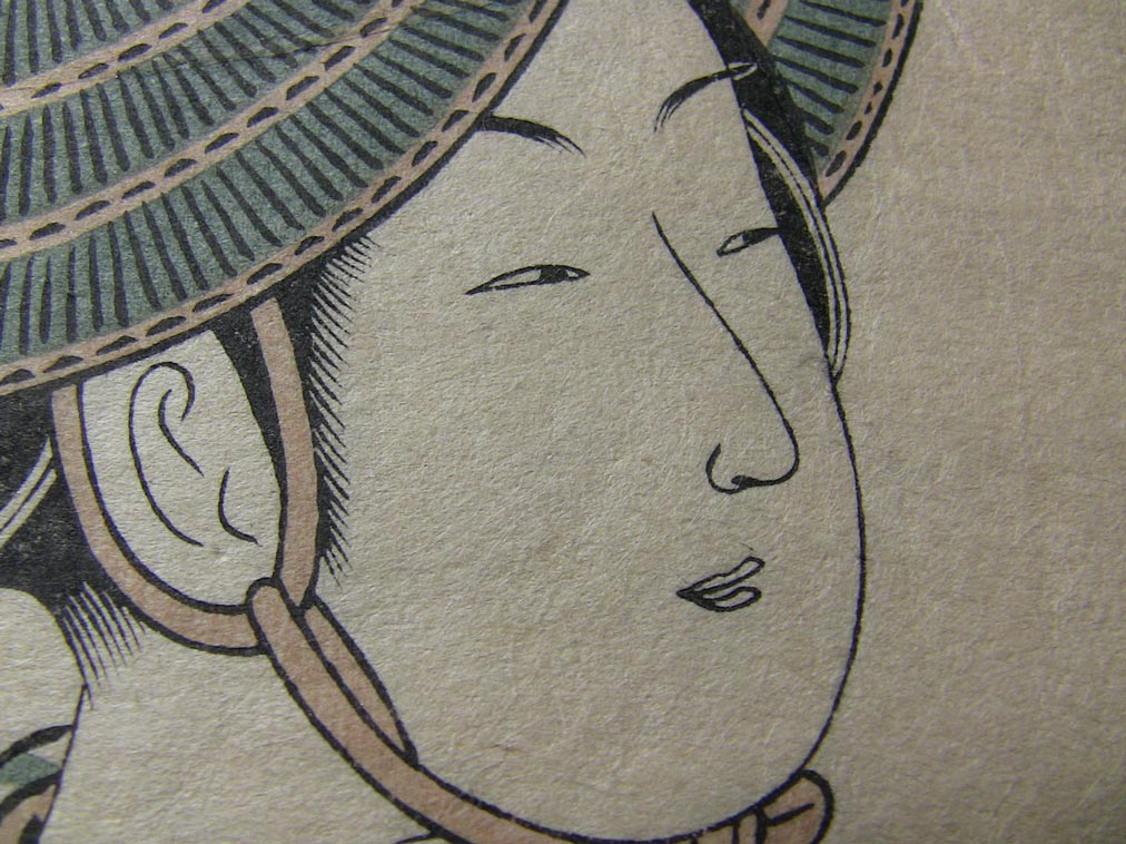
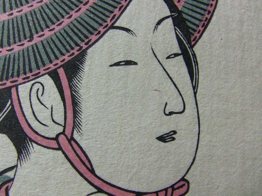
Takamizawa, on the other hand, clearly took another tack - make prints that, from the start, invoke the feeling of ineffable beauty that comes after 'some' time has passed. We clearly see the difference in the results in the first image above; the Adachi print is clean and bright, and the Takamizawa version is much more subdued. Here are closeups of the same area on the two prints:
Now back in Meiji times, there was a very big business in creating artificially 'antiqued' prints - taking reproductions, ageing them to look like Edo period originals, and foisting them on unsuspecting foreign buyers. There were many special techniques for this, involving the use of certain plum juices, dusting with cobwebs, etc. and etc. This is not what we are talking about here. Takamizawa was not taking a finished print and making it look old, they were simply trying to produce work didn't have the 'rawness' normally present on a new print.
Most of the people I have talked to about this clearly show a preference for the Takamizawa approach, but there is one very large problem with it. When you make your print look a hundred years old at the time you send it to your customers, what happens when a hundred years really have passed?
The answer of course, is that it ends up looking duller, gloomier and more faded than it should. And actually, that's what we are seeing in our sample above, which has had an 'extra' 100 years or so tacked on. At the time it was issued, it must have been quite a bit less 'gloomy' - nothing like the Adachi version, but perhaps something in between.
So the question now becomes, "Who are these prints for?" I have joked many times (it's not a joke!) that my collectors are not buying the prints for themselves, but for their grand-children. I tell people, "If you think my prints are too bright and clean, then just grit your teeth and wait ... Somewhere just around 100 years or so will do nicely!"
Anyway, to the question at hand, which of the two approaches will I take? As those who watched the proofing session this morning already know, I am giving my print the more gentle and 'toned' style of Takamizawa, but without - I hope - the gloominess. I'm going easy on the amount of sumi I drop into the colour bowls, and will use only a very light toning on the background. I think I can walk a good balance between the 2011 collectors and their heirs!
Printing will begin tomorrow morning ...

Got time for a bit more? Here are a couple more closeups:
What we're seeing here is not 'philosophical' difference in style, but an out and out collapse of craftsmanship. From 1920 to 1970, that's what happened. (Remember, these are the two 'biggest names' in the business here, both claiming to be inheritors of the old traditions.)