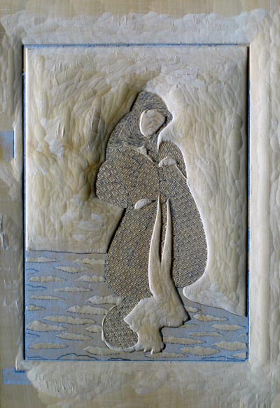
My new year 'cards' flew away around a week ago, and I'm already getting 'Got it!' reports from here and there. Those sent to addresses in Japan will all be delivered early tomorrow morning - New Year's Day - as that's how the post office here does it, but overseas ones of course arrive at random times ...
I thought it might be interesting to show the blocks ... in closeup! (All these images can be clicked to bring up enlargements.)
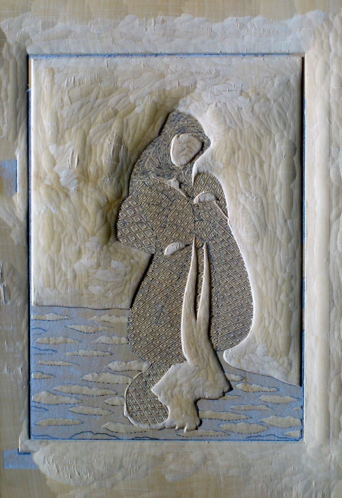
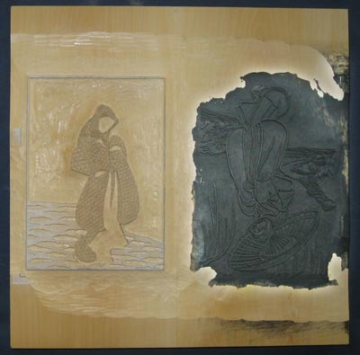
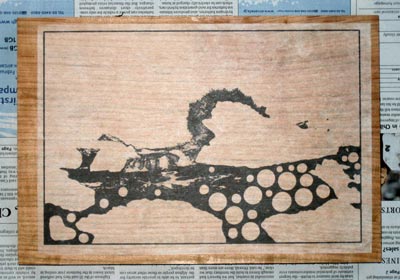
I used a special piece of wood for the keyblock this time; a wide piece of boxwood I prepared some years back and which has been 'curing' here on a shelf since then. It's made of two pieces of boxwood jointed together, and laminated to a firm piece of plywood for stability.
I used this wood for both the keyblock, and for the block used to make the karazuri (embossing). The two carved images are placed 'heads and tails' on the wood, with two sets of registration marks. (The funny white 'halo' around the black area is from my attempt to improve the visibility of the deep black area with Photoshop.)
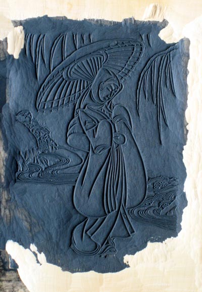
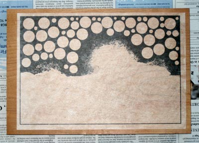
Here are closer images of the two areas; first the keyblock:
And then the karazuri:
At the time I took those pictures, no prints had yet been made. The keyblock is black because I used it to print a set of kyogo (colour separation sheets). And I also did some cleaning up after that, so the edge of the blackened area is ragged. (That block has since become completely blackened ...)
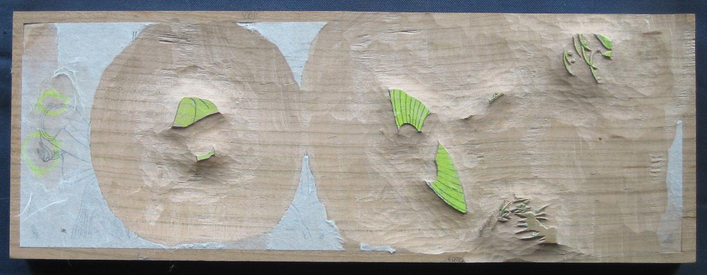
The karazuri block has not yet been washed, and still shows the paper of the hanshita ...
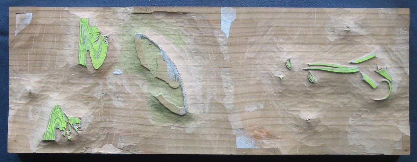
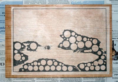
Here are the six colour blocks. Two pieces of wood, one used on both sides. Again 'heads and tails' with two sets of registration marks. You can see remnants of the kyogo sheets visible, as they haven't been washed at this point.


I printed 192 sheets in the first run (12 sheets of oh-biru size hosho paper, with 16 cut from each sheet). Registration was extremely tight, as many of the lines of the keyblock are on the order of 0.1mm wide. There is absolutely no margin for error. To help minimize problems, I 'painted' the corner of the paper with nail polish, so that it would 'click' into the registration mark securely. (If you are receiving one of these prints, you can touch the bottom right corner to test this ...) I also put a touch of the polish at the place where the paper rests against the other registration mark.
As for an image of the print itself, it's still too early for me to show that, but it will be uploaded to my New Year Cards page on the morning of the 1st ...
Posted by Dave Bull at 5:33 PM
| Comments (7)
Continued from [Seacoast in Winter - 2] | Starting point of the thread is [Seacoast in Winter]

Yes, about the circles ... it's kind of a long story.
When I was doing the printing for the Forest in Spring print (Chapter 11) some months ago, I had a very difficult time with the registration. I just couldn't get the tree trunks at the top of the print and the background to 'line up' properly, and the patterns on the forest floor also just wouldn't fit into place. When I lined up one side of the print, objects at the other side would be out of registration.
At first, I put this down to stretch in the paper due to the large number of impressions. When I printed the second batch of 100+ sheets I tried to be more careful with the paper condition, but still had the trouble. No matter how I shifted the paper in the registration marks, I was unable to get everything properly in place. The forest floor on the right half of the print is sharp, that on the left side is blurred, although I doubt that anybody would notice anything wrong by looking at their print.
A couple of month later, when doing the print of the moon (Chapter 3), registration was also trouble at first. I cut the registration marks very carefully, because I really wanted the smallest craters around the perimeter of the moon to be sharply delineated, but had a lot of trouble nonetheless. I was able to solve the problem that time, because the critical part of the design is in the center of the paper, and the margins at right and left need no registration at all.
I was annoyed at myself for the carelessness again, put it down to over-confidence, and made a promise to be much more careful with the next print.
But when I did the first test printing on the next one - the River in Autumn (Chapter 4) - it was even worse. I had actually carved a keyblock for that design, but the registration was so bad - off by nearly two millimeters from side to side of the design, that I had to discard it. And I was only saved from total disaster by the fact that the circular black over-printing covers all the details at the far left and right edges of the design.
Something was clearly wrong, and I finally realized that it wasn't me. At least I mean it wasn't just me being careless at printing time. The blocks themselves were inherently wrong. Something was spectacularly wrong with my hanshita preparation process.
The first three prints in the series - Chapters 1, 5, and 6 - had all been made in the traditional way, with the cutting of a key block first, then using that keyblock to print 'kyogo', colour separation sheets. I had no trouble with registration at all.
But these last three prints were not made that way. For these, I prepared the colour separations completely in Photoshop, printed them out with my laser printer, and pasted them onto blocks for carving. Photoshop couldn't be the problem, as everything there was controlled right down to the last pixel. The printer just spits out the correct data. But my pasting technique is very well honed after all these years - since some disasters very early on, many years ago, I have been rigourous with this.
Clearly though, one of those three steps must be the problem, so this time, I tested and checked at every step, to try and isolate what was causing the trouble.
The Photoshop data was of course perfect, - each of the colour separations in the master file had (of course) exactly the same dimensions. I printed the first one out, and then grabbed a ruler to measure it.
Bingo! Problem located ...
Not only did the dimensions of the printout not match what was in the original file, the printout wasn't even perfectly rectangular. It was 'twisted' and distorted by around 1.5 millimetres across the length of the image. I printed another one. Also twisted, but in a slightly different way.
I have two laser printers here, a small Canon I use for my invoicing, and a larger A3 Epson I use for printing the pages of the books for this series. I experimented back and forth with both of them, and found the same thing. They both were producing distorted output. It seems that the paper twists and turns ever-so-slightly as it moves through the printer and there are always variations in the finished sheets.
No wonder I had had so much trouble with the registration on the previous three prints; they had been 'doomed' from the start, as the distortions were carved into the blocks!
The solution seemed clear, just use a high-quality printer. I took the file down to my local printing company, and got them to run off a sample sheet on their room-sized giant digital machine. Same problem! It seems that this problem is inherent in copier technology. There is no way that the paper can go through all those rollers and twists and turns without the image becoming ever-so-slightly distorted, even on a top of the line professional machine.
So, what to do? Giving up the Photoshop separations, and returning to the traditional method of keyblock and kyogo would obviously work, but for this type of design, that was not a practical solution. I don't want outlines, and I do want the textured surfaces. So I need a type of printer that will output the Photoshop data without distorting it.
I also have a large (A3) inkjet printer here, but have never used it for hanshita preparation. Everybody 'knows' that output from these printers is susceptible to smearing when it becomes wet, and if I used this printer, of course the details of the design would instantly become smeared and lost when the sheet was being pasted down onto the wood. And could the sprayed output have anywhere near the sharpness and clarity I had been getting with the 2400 dpi laser printer?
But I had never tested any of these things, so I tried a small sample. This printer is quite an expensive model, and uses what Epson calls 'pigmented inks'. When I tried pasting down the sample swatch, it didn't smear at all. As for sharpness, there are dozens of settings available in the printer driver, and I experimented until I found the one that gave the clearest output onto my hanshita paper.
And as an added bonus, this printer also has a slot in the back, so the paper can be fed through it without bending around any rollers at all.
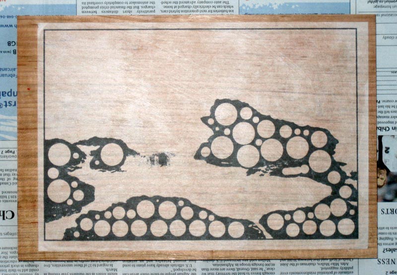
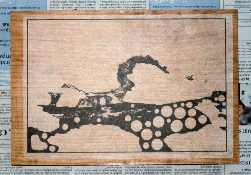
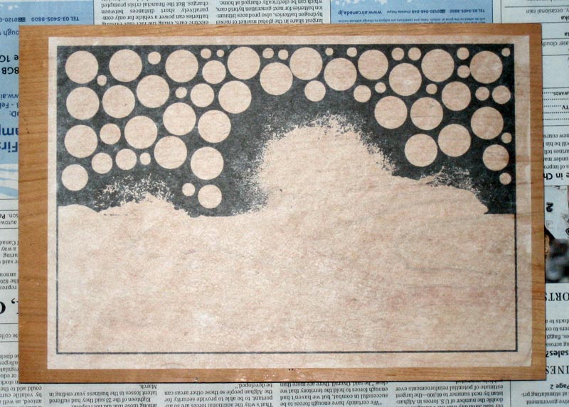
And here - long story, I'm sorry - we get to the point of the circles, which by now, you can presumably guess. To minimize any possible chance for distortion in these sheets, I have broken up any wide areas of solid colour, to avoid having the liquid ink cause any swelling in those areas.
It all seems to work. The first test sheet showed no perceptible difference in dimensions from the original file, so I went ahead and ran off the whole batch, checked each one carefully, and then pasted them down ready for carving.
At this point there is nothing I can do to 'fix' the blocks for the previous three prints, and any future editions taken from them will have to be done with the same struggles, but hopefully, this next one will come out clear and sharp, from edge to edge.
We'll see!
The thread continues in [Seacoast in Winter - 4] ...
Posted by Dave Bull at 10:31 AM
| Comments (6)
Continued from [ Next print begins - Seacoast in Winter]
Six weeks since the last update - at this rate, the Solitudes series will be wrapping up sometime in 2099!
What got in the way, of course, was the Gift Print season ... I 'opened' that page in late October, and somewhat to my surprise (because of all the very bad economic news in the paper these days), the print sold very well. I ran out of stock even before the 'early bird' special had expired (Thanksgiving day ...). So I had to get the blocks out and make some more. I ran 40 copies, thinking that it would be enough, but miscalculated, and had to run another 40 a couple of weeks later.
(That 'Leaping Carp' print is not an 'easy' one, as the multiple gradations on the water surface take quite a long time to do, so it perhaps wasn't the best design for me to choose from the point of view of 'time vs money', but it certainly was a good choice from the point of view of popularity!)
And then, of course I had to prepare the print for my own personal new year card. Thinking ahead to the future - when this 'private' print will make an eventual appearance on the gift page - I went a bit overboard, selecting a design that took around a week to carve, and another week to print (nearly 200 copies).
And in the middle of all this, I went down with a bout of the flu, something that hasn't happened to me in over a decade. That knocked another big hole in the schedule.
But the gift season is now behind us, my new year print is in the mail, and the flu has been completely beaten back. Time to try and catch up with this next print, before the waiting collectors assume I've given up!
As I mentioned in the previous post, my approach is going to be:
- work out a basic composition of the rocks and sea based on photos from some of my summer visits.
- transform this into a windy 'crashing waves' scene.
The first part wasn't so difficult. The volcanic outcroppings on that beach are quite photogenic, and it wasn't difficult to find/create a good composition. I had to 'trim' one of the large rocks in one place, but I think I came up with a good scene.
I focussed on one of the 'pools' where I swam during my warm-weather visits:
"My curiosity about these rock pools is quite aroused now, and I move over to the wide deep one that lies directly behind a large rock against which the sea is still smashing on the other side. It would have been instant death to attempt this a couple of hours ago, but now, even though the pool is open to the sea at one side, and the water level surges up and down as the waves roll by the opening, it seems quite safe. Using the mask, I float on the surface looking down at the bottom about a metre below me, while flying spray from the breaking surf falls like rain onto my exposed back."
It's a very interesting place, and during my visits I sat and watched it for hours. The water flows in and out, in and out, through the opening at one side, and the as waves arrive from the open ocean, water spills into the pool over the surrounding rocks. The photo I included in the previous post shows the pool:

At this point, I'm not going to show you the way that this scene has been transformed; you'll get to see that happen bit by bit as we move along.
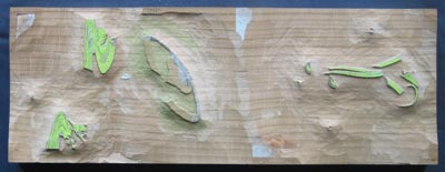
But to get the process started, I will show a few of the block images, in their 'ready-to-start-carving' state. So far I've made 15 'separations'; whether or not that will be enough isn't quite clear at this stage.
There are three basic areas to this print: sky, water, and rock, although in many places, they overlap quite a bit. Here are the three 'base' blocks that will delineate the three areas:
Carving begins tomorrow!
And I'm sure you may have some questions ... :-)
The thread continues in [Seacoast in Winter - 3] ...
Posted by Dave Bull at 4:51 PM
| Comments (2)