Posted by Dave Bull at 10:38 AM, April 16, 2008
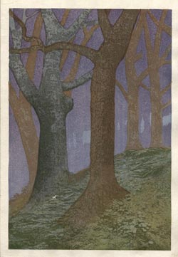
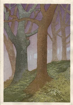
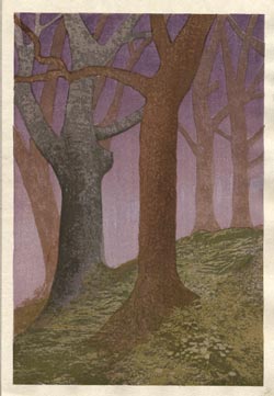
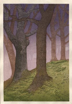
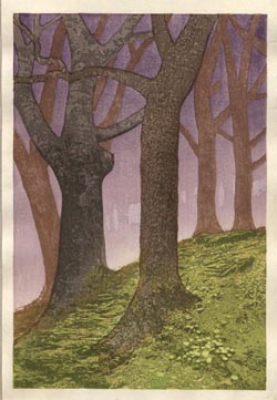
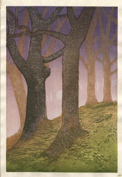
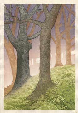
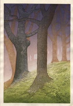
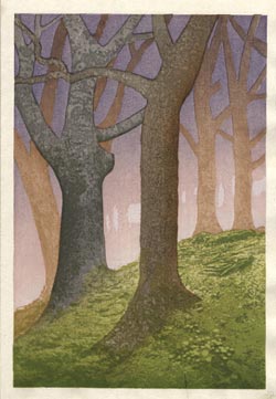
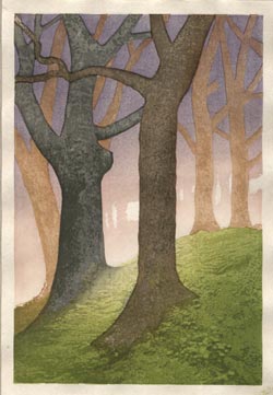
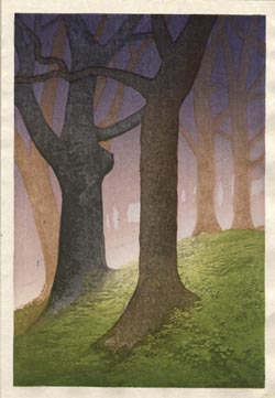
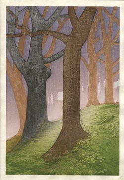
Incredible that this one is taking so much time ... there is a lot of detail in those ground cover blocks, and with all the other jobs competing for attention, it's going very slowly ...
Anyway, the blocks were finally 'finished' a couple of weeks back, and since then, I've been playing around with them, trying this and that, generally getting familiar with how they work together.
This is a block set that would be very suitable for one of those experiments where the same blocks could be used to make a series of completely different prints - early morning, deep midnight, etc. etc. I don't have the freedom to do that (right now), as the scene is basically set; this is supposed to be the view I see when emerging from my tent in the pre-dawn mist. Here's the quote from the story at the point where the image comes in:
"But I'm pretty much wide awake now, and although I do lie back on the mat in my comfortable bag, the sky is starting to show a faint light, and soon the birds are chirping their welcome to the new day. There's not much else for it but to obey their call, and get going on the day's activities. I slip my clothes on and step outside. It's quite misty; the trees immediately around me are clearly visible, but those just a short distance away are blurred, and behind those the forest fades into shadows. The pre-dawn air is of course still quite chilly, and damp with dew. A bit of a heavier sweater would have been a better choice to bring along on this trip, but as I know the day will warm up once the sun gets a chance to work its magic, it's not a problem ..."
So anyway, I've got some stuff to show. None of these are 'the print', as I am still not satisfied with what has come off the blocks so far, and have more tests planned, but they should still be interesting for people to peruse.
It's also worth noting that none of these were intended as 'prints', in the sense of 'finished' works. I really play around with these sample sheets as I am making them. I run a few sheets at a time, and even if I may think "Hmm, that sky looks pretty good," I will still put a sky that is 'too dark' on the next sheet, simply to see what it looks like, or that sheet may get an experimental version of a tree trunk, or whatever.
So here's a selection from the different proof runs made over the past couple of weeks. The earliest ones are kind of gloomy, and since then I've been trying to work out how the light should spill out into the image ... I'd be interested to hear what people think of these ...
To my untrained eye, #7 is the best as it most conveys the moment just before sunrise. It's the brightest and the most 'hopeful' if that makes sense. There is a real Hiroshi Yoshida quality to this in that I, too can see this print at different times of day. This whole series has been quite amazing.

i love this one its so beautiful
I like #5 for the foreground texture. It captured my attention right away. For early dawn Jim likes #1 best since early dawn is rather dark. Jim agrees with me about #5 being nice for foreground texture, and also the feeling of "Aurora, the rosey-fingered dawn" of the Greeks.
In the last six there's a feeling of headlights coming through the trees, rather than just light shining through tree trunks. So the Wohlkens like #1 and #5.
Fascinating to see your processes at work Dave. If the light is coming straight towards us (slightly from our right) then the foreground elements would be quite contrasty and in very heavy shadow as in row 2 second image, but you do need that bloom of light burning through the background layers. If the solid shape of very distant trees were burnt out rather than hard edged I think that would really add to the feeling. I also wonder if the colours of the 2 foreground trees would look better swapped, with the nearest tree being the darkest colour.
Beautiful proofs though, really lovely.
I'll have row 2 no. 2 and row 4 no.2 ; )
I agree with Mike L, I like #7. The angle of the light reminds me of camping in the backcountry of the Rockies in late fall. Getting out of the tent with my breath fogging and the barely dawn light just scraping across the grass. This is a great image.
Number 5 made me go OH!! I like the dark - light contrast and the fore ground texture. Number 7 keeps that texture in the fore ground but looks most like dawn to me. The comment about the darker tree up front is a good thought. An isolated dark will jump forward as well as a warmer color will seem to be more forward, you might play with that a bit and see.
I'm looking at the trees as suggested by Mark. The problem I have with switching the colors is it seems nicer the way you have it -- the cooler color breaking up the monotony of too many trees in the same family of hue together.
#7 or #8 is most dramatic. Then you move the sun.
Exciting as always..............
The centre one in row two does it for me, with the detail showing clearly on the ground at 'one's' feet and yet the rest of the world still only half seen. It just captures the magic of an awakening world.
For a pre-dawn look, #1 looks right to me. The ground cover looks great on these; I can't wait to get a good look at it.
Hello Dave,
Great stuff as usual :-). I am not convinced by #8 to #12 as the halo effect around the tree does not seem to fit. The first ones #1 to #4 too "dark", or may be too "early in the morning/late in the night". In the end #5 is the one I prefer.
I look forward to your trial...and to the print.
Take care.....Serge