Posted by Dave Bull at 11:51 PM, June 7, 2007
Continued from [River in Summer - 19] | Starting point of the thread is [River in Summer]

Here are the next four impressions (another good printing day!) ...
Impression #20 - Second portion of the central tree ...:
We can now see the reason for splitting this tree into two pieces ... Putting gradations on the pieces separately moves them into different 'planes'.
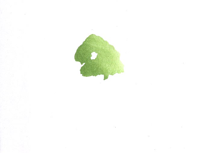
That impression by itself (on scrap paper ...) (block):
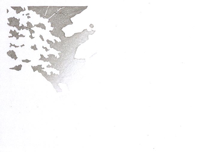
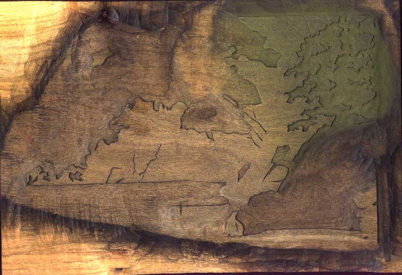
Impression #21 - Building up depth in the left background ...:

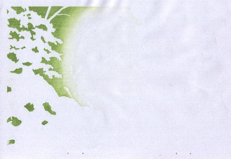
That impression by itself (on scrap paper ...) (block):
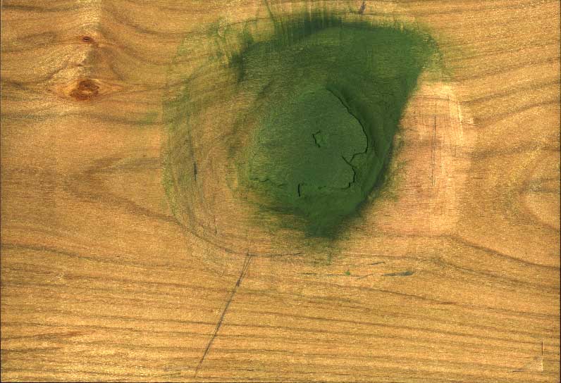
Impression #22 - Still more depth in the background ...:
This block overlaps quite a bit with the previous one, but not completely. The background sections 'hidden' behind that frontmost tree at the left (the one with no colour yet) are now deep green. Using two blocks for this area instead of just one, gives more variation in the depth of the background areas.
That impression by itself (on scrap paper ...) (block):
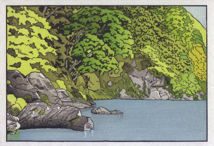
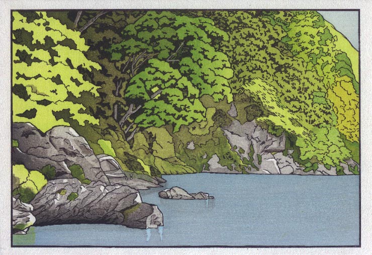
Impression #23 - Deeper tone on the river ...
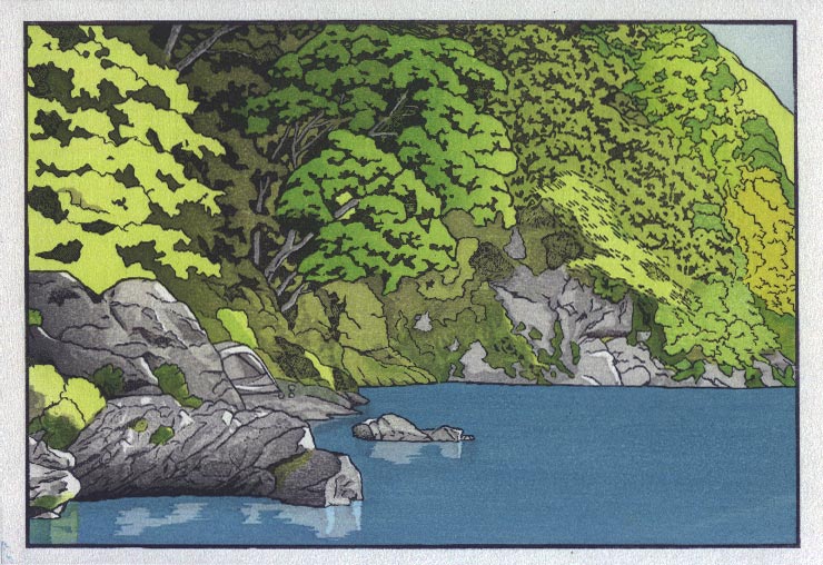
Interesting that the small area of the previous blue that still shows through, now looks so much lighter than it did in the previous image! But of course it hasn't changed ... simply it looks lighter because it is surrounded by darker stuff ...
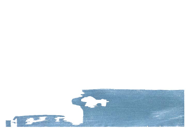
That impression by itself (on scrap paper ...) (block):
The thread continues in [River in Summer - 21] ...
The "walrus tusks" from impression #10 and the water highlight below the big rock which comes out in impression #23, are nicely coordinated and obviously planned out. Those lines don't exist in either the hanshita or the keyblock, but they still needed to be carved into (at least) 2 separate blocks. How do you coordinate those overlays? Is there some hand-drawing and tracing involved on the kyogo used for both impressions 10 and 23?
Marc
they still needed to be carved into (at least) 2 separate blocks
The water highlights (the areas appearing in lighter blue, with ripply edges) appear on only one block - the deep blue water block #23, so need no critical registration whatsoever - they are pretty much carved freehand, and I made only a rough scribble on the kyogo to show where they would appear.
In similar fashion, the 'tusks' (I wish I had never said that!) appear on only one block - #10.
The only coordination I had to do between them was make sure the tusks fell inside the cut-out area that would appear later. It wasn't critical to get anything lined up, so I just did it by eye.
But if something like that had needed to be lined up exactly, then I would have either had to use a muda-bori ('wasted carving') - carve the lines on the keyblock, do the kyogo transfers, and then cut off the lines - or I could have traced carefully on the appropriate kyogo, hoping that they would line up.
Ok Dave, print is looking good...I am wondering (or maybe expecting) some tree reflections on the water ??? If there are going to be any why did you not include them on the early color blocks or perhaps the reflections are diffused enough that
they can be handled with just one or two extra blocks at the end ?
Just one more thing....
"I am the Walrus...Goo goo ga joob"
http://www.songfacts.com/detail.php?id=138
tree reflections on the water
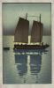
Reflections can be real easy or very ,very tough. A straight-ahead 'dark shadow' type of reflection is dead easy - just carve a block for it, and print it over an existing water area. Here's an example:
In the opposite case - a light-coloured reflection - it can be easy, like the example we are seeing with the stones in my print, if that light-colour is allowed to run all the way under the entire water area. For these cases, you just chop out an area of the water ... equally simple.
The tough one - and it is tough - is when you want a reflection lighter than the overall water tone, but containing a colour that can't be allowed to run under the other water areas. For this one, you need to cut out the water area, get it lined up with a block cut for the reflected area ... and get all the edges to the proper 'fuzzy' appearance, with no gaps and no overlaps that will create unwanted colours.
This is so difficult to do in an attractive manner, that a quick browse through the Hasui collection book I have here comes up with exactly two examples ... in over five hundred prints, a huge number of them having water reflections.
Anyway, long story short, I did try a couple of experiments at reflecting the far bank in the water, but found it just disruptive and messy. If I were making this print at o-ban size, it might be somewhat easier, but at this smaller scale, it just didn't work.
