Here are my comments as emailed to Dave earlier. I added some more thoughts, inspired by the Round Table dialog format:
When I move the cursor in the section which includes the 'Prints' button, there is an illumination that follows the cursor, highlighting the button that is being pointed at. That illumination "feels" very good to me. The button lights up on the top and bottom margin, so it's clear what's going to happen.
When I press the 'Prints' button, there is a print displayed. If I move the cursor over the image, a navigation box with 3 icons appears in the upper right corner. It's not there unless the cursor is over the image. I had to "stumble" upon it because there is not any indication that I need to move the cursor over the image to have more options. The UI for the icons does not "feel" right to me. The icons themselves don't clearly show what is going to happen if they get pressed. Also, the "toggle" aspects of the title display and the text display are less than intuitive for the casual user.
I'd rather see the title displayed above the print image always (not as a toggle-able option). Also, I'd rather see the descriptive text and zoom options as text buttons under the print image, so that they are always visible. Once the descriptive text is shown, a print image button could be displayed to go back to that view.
Additionally, the way that this page is currently configured, there is a level of UI choice which is missing. That is the choice of one of the multiple prints which will be in your series. For the purpose of the current experiment, it seems important to address that level of choice at the same time as the choices that happen within a single print, so that the user interface will have some sort of continuity.

Additionally, the way that this page is currently configured, there is a level of UI choice which is missing. That is the choice of one of the multiple prints which will be in your series.
Yes, I'm sorry Marc, I should have made that more clear (I've added some additional description to the post above, so that the next person might not be so confused ...).
Once it's up and running properly, pressing the 'Prints' tab will not jump directly to a print, as we see here, but to an intermediate navigation step. I'm getting ahead of myself ...
I agree with Marc on the points he made, all valid.
So far I also do not have any additional comments. I just sent an email by way of the contact form to check whether that works...
By the way, Marc: yesterday I discovered that the link to your Shin Hanga Date Translation article resulted in a 'not found' error, but today this seems to have been fixed.
The icons themselves don't clearly show what is going to happen if they get pressed.
OK, I've redesigned them; the icon for the 'story' now includes an arrow mark; this hopefully will imply that the document will move 'up' if the icon is pressed.
Also, the "toggle" aspects of the title display and the text display are less than intuitive for the casual user.
My first attempt used a 'circle with slash' to try and show that pressing again would reverse the previous action, but that just didn't make sense. I have changed them so that the arrow mark is reversed once the story has slid up into place, and now points downwards ... And the 'post note' now includes an 'x' mark, which I would think should clue people in that clicking it would send away the note ...
And I'm learning about 'easing' ... how to make actions happen gently, instead of suddenly. (The way that the shadow behind those icons 'eases' into place when you roll over ...)
I'm getting more used to the idea that you put the cursor into the image to raise the menu. There is a strong precedent for this logical approach in many video-viewers and also in Google's street view application. No problem there.
Now that the "choose which print" intermediate menu is available, I'm a bit concerned with how one would return to that menu once looking at a single print. The only way that I could find is to press the "Prints" button again. It seems that it would be more friendly to include an "Exit" or "Back to previous menu" icon in your set of icons.
The arrow approach to the text page feels better to me than the slashed circle, but I'm not sure whether that's because of logical reasons or because the arrow is darker than the slashed circle was and is therefore more prominent.
I'm still thinking that the title shouldn't be an icon but rather should always be present. The additional text envisioned in the title box can be absorbed into the text page and is therefore not necessary, IMHO.
I'm getting more used to the idea ...
Marc, you should just 'give up' now, and accept that all my suggestions are 'perfect' ... :-)
(Yeah, right!)
... how one would return to that menu ...
Still haven't decided on that one. I added the '18 prints' page just before heading to bed last night, even though there is no way to get 'back' yet. I could add a 4th icon to the little slide down panel ... or maybe have another separate panel. The idea with that would be that the little panel you see now is dedicated to 'print details', and the other little panel (bottom up?) would be navigation between prints: previous print, next print, back to the 18, etc.
We start to get a lot of 'controls', but anyway, we do need controls - the question becomes whether or not they should always be visible, or appear only when needed.
They direction I'm moving on this is to keep them out of sight, meaning that the resulting pages will be 1) quite sparse and 'clean', and 2) full of motion and action as you move around. I'm thinking though, that if I keep everything 'gentle', it should be OK. Or maybe it'll make everybody seasick, I don't know.
I think also, that after the first minute or so, the viewer will soon 'get it', and that browsing the site will then be smooth and clean.
If anybody's watching ... the current version (this evening) is a 'tryout' of two different navigation tab methods on the print view page: one is completely hidden, but comes out when the viewer rolls over the print, the other is peeking out - to show its presence - but only comes into view when directly rolled over.
In the final version, they of course should work the same way. But which? (Or other?)
Hi Dave,
Just having a look at the page for the first time tonight, so I'm coming to your latest version totally fresh.
I quite like the totally hidden roll over tab, simply because it is hidden. The little bit of the tab that peeps out on the lower tab all the time is a little irritating, just sat there, waiting, but making its presence felt.
The only problem with the totally hidden tab is that it pops out fully every time you roll over the print, even accidentally, which is a bit of a distraction.
How about mixing the two styles: Completely hidden until you roll over, when a small 'more info' tab just peeps out and shows itself, which can then be clicked on to fully reveal it? Or is that over egging the pudding?
Everything else looks good, and I like the idea of using similar pop up title info to those used in your favourite prints ebook. It keeps your 'house style' consistent across all your projects.
And I'm learning about 'easing' ...
Easing or buffering, or as us animators call it, cushioning is a lovely thing. It's what turns a mechanical movement into something more natual and flowing. Ease in and out of a move for the smoothest effect. I could talk all day about easing. We'll make an animator out of you yet, Dave!
more natural and flowing ...
Yes, that's the project for later tonight, after the evening carving session - turn the horizontal/vertical'jump' into a smoother animation. Not quite sure how to do it yet, but it should be fun trying to figure it out ...
[Update: done!]
Having looked at your latest version this evening, my suggestion would be to leave the prints on your overview page of the 18 prints in static mode (i.e., no dynamic change in terms of enlargement of each separate print on this page when the user moves his mouse over any one print)...
Moreover, when I move my mouse very quickly over the items on this overview webpage of your prints, I get very strange effects: the prints become larger, and larger, and then even larger.
larger, and larger...
Hah, look at that! Well, this is what testing is for ...
And yes, it's all experimental of course ... not sure how much movement to include; probably too much as it stands.
What do you think about having two separate navigation tabs? I'm thinking to combing all six icons into one tab, sliding down from the top. ??
Right now though, it's downstairs to (real!) work!
I personally like the "sparse" look but agree there should be clear indication of "what can happen if I click on what".
Maybe have the print enlarge as the mouse moves over it like a Mac sidebar widget? Then if you click on the print while it is big, get all the info, title, etc. Just a suggestion for the box.
Also, PLEASE! $35 ea. is still VERY reasonable and more in keeping with the times and the effort that is involved.
Maria
Maybe have the print enlarge as the mouse moves over it
Not quite sure where you mean here ... Do you mean the main print image? The way it works now (or is supposed to be working ... not sure what you are seeing) is that as soon as your mouse moves into the print image area, the small toolbar slides into view.
(I'm almost certain that I'm going to combine the two navigation tabs ... just haven't had time for playing with this)
$35
Boy, I'm really wrestling with this one. Every single person who I have talked to about this says the same thing: $25 is too cheap.
I know. I know. It's not only too cheap for the product, it's just barely break even for the project itself, ignoring my labour. At that level, if it were fully subscribed (200), I'd still have to depend on other stuff (back numbers, etc.) to get by.
If it were $35, and fully subscribed, I would finally be able to start putting a bit into the bank, something I haven't been able to do for nine years now, since I bought the house.
But ... I have to get a pile of subscribers for this one; if I don't, then I'm a dead duck. And I have to charge for the case with the first print, and that's going to be at least $20 (putting it out at around my cost), so if the print price goes over $25 we're going to head north of $50 for the initial payment (with the postage).
What percentage of potential subscribers will be put off by that? Here in Japan, the difference between 2500 yen and 3500 yen will be almost irrelevant. It's the overseas market that is the unknown question for me ...
UPDATE! I received a package this morning from Mark Mason over in England ... a little something that I asked him to work on ... and boy, did he come back with some great results!
Might as well let you see one of them ...

Oops! No, that's not it ... That's the original sketch that I sent. Here is his version - just slightly improved!

Woot!
If anybody's still in here ... there are a couple of 'issues' to look at, please:
- lower menu. It has been apparently 'misbehaving' for some people, with the light following the mouse properly, but refusing to 'stick' on the inner pages, and always returning to 'Home', even when the content being viewed is another page. Is anybody else seeing this? I can't reproduce it here.
- Front page slide show. I had to toss out the original version, as it turned out to be unworkable in older Explorer browsers, but is the current version any better? And is the 'navigation' clear? It should just play with no clicking at all. The controls are only there if you want to control it manually. Clicking the 'Pause' will turn it to manual mode, as will clicking either of the arrows. Clicking the 'Play' will then put it back into Automatic mode. I thought this was pretty self-evident, but it seems that there is some confusion ...
I'm using Internet Explorer version 7.
The lower menu traveling light is sticky for me, remaining at the option where I click.
The front page slide show is fine. The slides move faster than I can read, and that was a bit "panic" inducing. But, the controls were visible and once I decided to take control, it was easy to figure out.
However, the "Prints" button doesn't work. When I click on that, the slide show still has control.
Marc
"Prints" button doesn't work
Eh? This is not what I want to read one minute before heading off to bed! Do a 'Shift Reload' and call me in the morning, please! :-)
Morning here ... and I can't reproduce this problem at all. Not sure what is being reported; so clicking 'About', 'Subscribe', or 'Contact' works OK, but 'Prints' doesn't?
'Prints' should take you to that temporary page with the six sample images from the Treasure Chest.
??
None of them work. The slide show is entirely persistent.
Well, I tell you ... I'm stuck stuck stuck on this one ... I've wasted more time than I can believe. (And Marc has helped by repeatedly testing alternatives ...)
It's the lower menu that is suddenly causing problems. The original simple version here, which has only the Contact page active, seems to be working fine.
The built-up version here, with the slideshow, seems not to be working (for Explorer users only). Marc and I tried versions with the slideshow removed, but it made no difference.
I have no Windows machine here for trials and testing, so can I ask - does anybody out there have Explorer running with a debugging toolset activated? Can you see where the html - or the javacript - for that menu is failing? (I have this kind of debugging tool built-in with Safari on my Mac, and it is a wonderful help for this kind of problem. But it is not helping with this Explorer problem ...)
Had a bit of time for this tonight (spent the day on a trip down to Tokyo port, to do the import paperwork for the Solitudes cases), and all I can think of at the moment is to strip out some functionality, and step back to the point before things went wrong.
I'd like to hear a report please ... do a Shift/Refresh, and then try the bottom menu. The 'light' won't stick to the clicked menu items any more, but hopefully, the link will now work ...
The main bottom menu works fine here, both in Firefox and in Internet Explorer version 8 (IE 8).
As I mailed earlier to you today, the drop shadows of the menu items in the individual print pages are black, however, even though I'm using IE 8...
Thanks Jacques ... I've just added a conditional stylesheet, so that the modern transparent png images should no longer appear in any Explorer versions.
Simply cutting out functionality bit by bit here ... all because of that damned browser ... At this point though, I'm starting to consider something that I've never done before: putting up a FAQ page with a notice: "Sorry, this website does not work at all with Explorer browsers. I can choose between making prints, or making this site work for you. There is not enough time in my life to do both. Although I would love to have you enjoy my work here, and perhaps even have a chance to receive your order for some prints, I am now heading down to the workshop. See you later - in Firefox, Safari, or Opera."
This might lead to a solution ... who knows ...
OK, had no luck on getting help with that job posting, but I've been busy myself - there are a lot of changes under the hood, and perhaps Explorer will behave a bit better now. Please let me know what you find ... (And by the way, if you have only been browsing in Explorer up to now, it might be worth taking a spin through the site in Firefox, Safari or Opera. And I do mean a spin!)
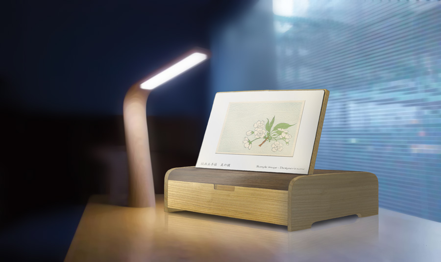
I've also put a mockup of the first print in place (a Meiji-era illustration from Mishima Shoso).
Meanwhile, on the case end of things, I have now completely given up on the Chinese guys. The shipment of cases for the Solitudes prints has turned out to be - how shall I put this - 'somewhat' less than acceptable. They are bugging me for this new job, but no way. Once bitten, twice bitten, three times bitten ... how many more times will I get bitten before I learn ...
In fairness to myself, I wasn't looking for a 'cheap' job when I hired them. I was trying to keep the end user costs down of course, and thought that I could find a reasonable balance between the inexpensiveness of the typical Chinese stuff, and the very over-priced quality of the Japanese work. Didn't work out that way. Even paying a premium to get better work (boy, was that a stupid thing to do!) made absolutely no difference; they are simply incapable of understanding a better quality level. Nike and Adidas can usually get away with it - by having managers right there on the factory floor, constantly supervising - but I have no such option.
So there really only now seems to be one option left for these cases - build them myself. I can do that - and will have a lot of fun doing it, too - but getting them done before April 1st just doesn't seem possible ...
[Update]! More action on the case situation!
Printer friend Ueda-san and I were talking about this series the other day, and he has agreed to lend me a pile of the old books from his collection, as potential source material for the images in this series. (And I've already come up with the first one from one of these books ... more about this later!)
While we were talking about all these things, he mentioned that a young friend of his works as a 'woody' craftsman, and could perhaps help with this problem. He said he would make a call ...
He did ... the boy called back ... we chatted about it ... he said he would put a proposal together ... he did ... and it looks like it might be doable!
He's suggesting we use walnut for the body and top of the case, but I think that'll end up being way too heavy to ship, so we discussed other options. But it does now look like there might be a way through. I'll keep you posted!
Here's my latest status report :-)
The dia presentation and its controls on the home page work fine both in IE8 and in Firefox.
In the page with the first individual print from Mishima Shoso, the three menu's at the top now go up and down all the time when I move my mouse over them (and can therefore not be selected). This happens both in IE8 and in Firefox.
When I go from that page to the page with the second individual print from the hanga treasure chest, however, everything works fine. On this page, when requested the title text of the print extends beyond the bottom of the yellow sticker in Firefox. This is not the case in IE8.
I wish you better luck with the second make of the cases for your Solitudes series!
Jacques, thanks for more of the testing ... As for the quirky behaviour of the navigation tab, you're catching me half-way through a re-write of that section. (I began late last night, and will work on it some more this evening).
I'm trying to ensure that these pages will work when navigated with a mouse normally, but also when viewed with a tablet device. You may have noticed the small icon down at the lower left. That is now active, and you can 'tell' the site what kind of input method you are using.
Please check the roll-over on the navigation tabs with the two different methods selected ... (you have to re-access a print page after changing your selection though ...)
But to help confuse things even more, print #1 and print #2 use different internal code for the roll-overs, so when testing after making the mouse/tablet switch, they may behave differently ... (so there are four different combinations).
Hopefully by later tonight, it will make more sense.
(And I'm very confused about the main menus. They don't work for Marc, but they do for you, with the same browser ... Sheesh ...
later tonight ..
Here we are ... Solitudes block set was finished this morning, so I'd like to get this thing out of the way before clearing my head and working on the proofing. I just re-wrote the entire navigation system, simplifying simplifying simplifying ...
Here's what I see on my machine; I hope yours matches:
When you first hit the pages, you are in 'mouse' mode. Check the icon at the bottom left. If you ever change this (by clicking it and using the preference control) your new preference will be stored as a cookie, and will still be active the next time you visit. So if you change this for testing, and things seem screwy later, please check this status (blue border shows active status).
The navigation (in the print view section) has all been put on a single tab, which shows at top center. It has three appearance modes: showing normally, showing just a 'peek', and hidden (although that too shows a tiny peek ...).
OK, in mouse mode: you see the grid of 18 and select a print:
- as the page opens, the navigation should slide out into 'peek' mode.
- roll over the tab opens it fully
- roll away sends it back to 'peek'
- rolling out of the print entirely hides it to give a completely clear view of the print
- clicking the print also opens the tab fully / clicking again returns to 'peek' (people may never notice this, that's OK ...)
- clicking icons does the stuff
- when the yellow note is open, clicking it hides it (as does re-clicking the icon, or walking away off the page)
- when the story is open, clicking it hides it (as does re-clicking the icon). Walking off the page doesn't hide it, as they may be trying to scroll down to see more ...
After playing with this for a while, this now all seems very nice and intuitive to me. I hope you agree.
Now. Next step is to try the tablet mode. Once this is selected, there is no such thing as a rollover - there is only tapping (clicking, if you are testing this with a mouse system). (I'm speaking of inside the print viewport at the moment, not the lower menu, which I haven't messed with yet).
When you arrive at a print page, the navigation shows 'peek'.
- tap the peek to open it, or ...
- also tap the print to open it / (tap again to close)
- icons work as before
- because there is no mouseout, stuff can only be dismissed by tapping it, not by rolling away. (I'm sure tablet people are used to this.)
**********
OK, that's the navigation. The other things I need to hear about are:
- the (still ongoing?) question with the lower menu. Does this now work in Explorer, or not?
- has the problem with icon transparency been fixed? (some icons were showing black areas instead of transparent ones)
- when changing between a horizontal print (#2) and a vertical one (#3), does the page animate nicely? It's difficult for me to describe how it looks ... the print viewport stretches/shrinks to fit the incoming print. (It's most effective after you have browsed the prints already, and you then have them in your browser cache. The animation between them then works smoothly. At least it does for me.)
***************
You may think I'm fooling around with stuff that doesn't need doing just now, and that's kind of right. But this whole mouse/tablet navigation thing is (I think) really going to become important in a very short space of time, and the sooner we get it worked out, the better. So what I'm learning now will go site-wide later, of course ...
Thanks so much to you guys for the time you have spent on this ... it really is very much appreciated, and I'd be really stuck without this help ...
Other stuff ... (about the series itself, not the web programming)
The 'About' and 'Subscribe' pages are also 'done'. I have tried to be vicious about cutting lengthy passages and keeping the description as concise as possible. This is especially true with the Subscribe page. But when I read over it again now, it seems so impolite in tone ...
And ... the price. Giving up on China means that no way can the case be $20. I got an estimate from the workshop I mentioned, and they figure about 2600 yen. On top of that I'll have to get them shipped here from their workshop, and get some shipping cartons made too. So my cost is going to run a minimum of 3000 yen.
But with the print price at $35, putting the case at about the same price means the initial payment by a collector would be well north of $70 (with shipping), and I think that would severely impact orders. This is supposed to be a 'recession' project ... 'easy to buy'!
So in the interests of getting the subscriber base expanded as much as possible, I'm thinking that I should eat a bit of the case cost, and put it out at:
- print $35
- case $25
- shipping (initial time) $7.50
Giving a first payment of $67.50 ... keeping it under $70.
Subsequent shipments are easy: $35 + $3.50 shipping ...
There is an alternative idea - make the case 'free' (bury the cost into the print price), and make the prints (say) $37, but there are two problems with that:
- I always get a bunch of quitters in the first few months. It's a real pain, because it breaks up sets, but it does always happen. And if they haven't paid for the case, I'm screwed.
- I need the case $ up front, or as close to up front as possible. I have no 'line of credit', and no savings, so the only way for me to pay for the cases is to get you guys to pay for them first ... :-)
Once registrations open for this series (hopefully in a couple of days) and people start signing up, I'll be putting their first invoices on line right away, and the subsequent income from the first 100 people (hah!) is going to go straight into the pot for the case makers. (I'm having to order them all in one batch of course - 210+ of them - to get that price.)
For me ... the 'household money' for the end of Feb (mortgage, insurance, etc.) is now almost saved up. For the end of March it will be coming from Solitudes #12, if I can get that out the door soon (sheesh, I had better finish writing the story!), and for the end of April it will hopefully come from stuff sold at the exhibition. Come May ~ June, I should be settled and on an even keel!
On my windows machine everything works as you describe - both in mouse and in tablet mode - except that in Firefox the navigation tab is missing on the second print, in both modes (in Explorer the navigation tab on this print is available). In Firefox I therefore could not check the smoothness of the transition from a vertical (#2) to a horizontal print (#3).
The problem with icon transparency in Explorer has not been fixed yet: selecting an icon in the navigation tab still resuts in an ugly black drop shadow, while the yellow sticker with print title information has a thin white border surrounding it.
In Firefox the print title information text still extends beyond the lower border of the yellow sticker.
However, on my machine the main lower menu works without any problem in Explorer 8!
The problem with icon transparency in Explorer has not been fixed yet
You were just a couple of hours ahead of me .. I have just put up an 'Explorer-only' stylesheet, one that does not use icons with transparency.
In Firefox the print title information text still extends beyond the lower border of the yellow sticker.
This too, has now been fixed (I think). I was careless with the styling of that note ...
... in Firefox the navigation tab is missing on the second print, in both modes (in Explorer the navigation tab on this print is available)
I have no idea what may be causing this; it just doesn't make sense that it could be missing on only one page, as the code is identical on the others ... and of course in the other browsers ...
If this kind of trouble keeps up, it looks as though the only people who may be subscribing to this new series will be Apple users!
You're right: the icon transparency problem in Explorer has now been fixed!
However, after the changes you made last night the print title information now not only extends beyond the lower border of the yellow sticker in Firefox, but in Explorer as well...
Finally I also checked your website in Safari and found that the navigation tab on the second print is available there (but still missing in Firefox).
OK, I give up. Done. Cooked. No more.
Here's an alternate site, with pretty much everything getting stripped out, just for Windows.
So far, I've stripped away the menu animations, the internal page reloading, and many of the transparent pngs. I haven't changed the print navigation yet, although if that is still causing problems, out it will come too ...
If this works without problems, then I'll put a little 'sniffer' in the header of the main site, which will detect Windows people and send them to this one ...
Work is continuing on other jobs too. Around the end of this month, I'll be doing a 'mass mailing' here in Japan, with two items - the exhibition announcement 'postcard' (actually a little tri-fold pamphlet), and the pamphlet describing the new series (with order form). (We're talking postal mail here, not email ...)
I'll be sending this to not only current mailing list people, but to everybody who has ever bought prints from me anytime in the past.
I've started to get this stuff ready, and here is a mockup of the content of the inside of the tri-fold pamphlet on the new series. It's partly put into Japanese already, but most of the body text is still English, so you can get the idea ...
As for the exhibition tri-fold pamphlet (which will be Japanese only), it is now back from the printer; here is the outside, and inside.
I'm quite sure that a pro designer could find a million ways that these things could be improved, but anyway ... there they are.
Final test ... the 'sniffer' ...
There is one final thing that I can't check by myself - the page that automatically sends Explorer users one way, and other people another way.
As a test, please visit this page in various browsers:
http://woodblock.com/mystique/index_check.html
If you are in Explorer, you should automatically end up here (note the 'ie' directory):
http://woodblock.com/mystique/ie/index.shtml
And if you are in Firefox (or anything else), you should end up here:
http://woodblock.com/mystique/index.shtml
If this clears the last hurdle, then I guess I'll be ready to make the final clean-up (pull out the extra print images that were there for testing), and then open 'er up ...

