Return to the Table of Contents / About this book
Color Printing from Relief Blocks Ernest W. Watson (an extract from 'The Relief Print') New York 1945
A fellow artist once said to me "There's too much hard labor in color printing, the cutting of all those blocks, the endless experiments with color and the final work of printing - too much drudgery to be justified by the results."
Well it's a hard enough job and it takes endless patience but like any real adventure there are plenty of thrills along the way that amply reward the expenditure of hours and energy. I'm sorry we could not have reproduced a set of progressive proofs in color. Such color proofs, showing the subject after each added impression would give at least a hint of those thrills. Frequently the progressive proofs are so lovely in color that the artist often thinks his print esthetically more satisfying when it is but half done, even though it is incomplete as a picture. And the surprises - not always happy, to be sure! One knows of course that a blue printed over a red will give purple, but subtle variations in inking and pressure and quality of paper often bring forth unpremeditated effects of rare beauty.
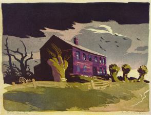
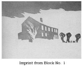
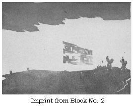
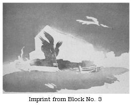
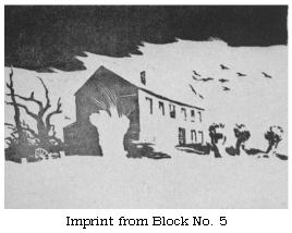
"Deserted" was done with five blocks and twelve colors. That
means, of course, the application of more than one color to each
block. Even though the impressions from the various blocks shown
below are reproduced in values only, they give a suggestion of the
manner in which several colors go on a single block - but only a
suggestion.
It is readily seen that different colors can be applied to isolated relief areas as in proof No.4. But that is only part of the story. In the color reproduction, refer to the blue-green patch in the foreground: that was printed by block No.4. Note that it is bluer at the left; a roller charged with blue ink was "brushed" over that part after the green roller had done its work. It is quite possible to "paint" rather freely with the rollers in this manner, producing an infinite variety of gradations of hues.
The halftone cuts below show how the color print "Deserted" was built up with five blocks. Twelve colors were employed, as many as three colors going on some of the blocks. Note that every impression deposits some color on the dark cloud area.
 |
 |
 |
 |
 | |
"Deserted", as indeed all of my prints, is done in oil color. Instead of the especially prepared printing inks I prefer a good make of artists' oil colors. But these must have at least a small quantity of printers' mixing white added in order to make them behave properly on the roller. The varnish in mixing white gives oil pigments the necessary "tacky" quality. Using the same palette of artists' oil colors as for painting, one is assured of permanency.
I use a Japanese handmade printing paper called Goyu. It is a soft, heavy paper, capable of absorbing all the pigment one might care to apply with several blocks. Printing paper must be very absorbent, otherwise the pigment remains on the surface and gives a hard "painty" effect. With the proper paper and just enough pigment on the blocks a print receiving eight or ten impressions will have a crystal-clear, free-from-pigment quality that is its peculiar charm.
Receptivity of the paper is indeed one of the essential conditions for fine color printing. This quality accounts for sympathetic edges and the "blending" of the various colors, which really amounts to their mixing after being applied to the paper. The method of printing successive colors while the undercolors are still wet is contrary to the practice of the commercial print shop where the first color is permitted to dry before another is added, and the results are as unlike as the methods employed. Print red over yellow after the yellow has dried, the yellow modifies the red merely because the red is not quite opaque and the yellow is seen through it. Print the red over the yellow while still wet, and the red is more strongly influenced by the undercolor, and in a different way: the two colors actually combine and produce a third color. The importance of this distinction is not apparent until experiments are made and the infinite possibilities inherent in wet overlays are thus convincingly demonstrated.
Some artists do their printing on etching presses, others use the Washington Hand Press. With either type of press the blocks must be very carefully adjusted (in thickness) to the space between roller and bed - in the etching press, and between bed and platen in the Washington Hand Press.
A screw press with a platen that is lowered and raised with a wheel seems to me the ideal press for color printing. Some years ago I adapted an old letter press of this type to my use by substituting a twenty-inch wheel for the much smaller wheel which had formerly served well enough for copying letters.
This kind of press makes for rapid printing because blocks of varying thicknesses can be used in succession without a single adjustment of the press. You merely turn the wheel 'til you get the required pressure. The amount of pressure, to be sure, is a matter of feel, but that is far less difficult than one would imagine.
One of the first problems that occurs to the color printer is register. Some mechanical method must be devised to insure the accurate impression of each block in its proper place in the design. A frame of thick cardboard into which each block fitted perfectly would do the trick. But one corner and one side of the frame do just as well - better, because the fitting of blocks into a frame is a nuisance. The Finder is a simple device for register. It is merely a 1/4-inch board with a projecting strip nailed to one end. To provide a means for replacing the Finder on the printing paper in precisely the same position, two one-inch holes are bored and are covered on the under side with pieces of transparent celluloid. A pinhole in each celluloid allows the sharp point of a pencil to make two dots on the printing paper. In replacing the Finder the pencil dots are readily seen through the celluloid windows. [Ed. note]
Register: The accompanying sketches demonstrate a simple method of color register, that is, securing the accurate impression of each color block in its proper place in the design. The Finder is a home-made device.
It is advisable to indicate the "working corner" on the back of each block by a black arrow.
This sketch shows the printer making register dots through the "eyes" of the Finder, which is in position against the "working corner" of the block.
This sketch demonstrates the correct method of holding the block while it is being lowered in place against the Finder, the third and fourth fingers are left free to steady the Finder.
Now the employment of the Finder in printing, as described above, presupposes its use in the preparation of the color blocks. Indeed the Finder is useless in printing unless it has first served to relate the patterns of the blocks as they are being engraved. And this involves "offsetting."
The preparation of the blocks for a two-color frog design - the original is in black and green - will demonstrate a process that applies equally well to a fine- or ten-color job. The black block was first engraved without reference to the Finder. Fig.1 shows an imprint from this block. Before the block was lifted from the paper, the Finder was laid down on the paper in contact with the left side and upper left corner, and two dots were made on the paper through the two "eyes" of the Finder.
The second block, its surface made very smooth with fine sandpaper or steel wool, was then set in place in the Finder. The Finder was removed and the block put in the press. The impression of the engraved No.1 block was thus offset upon the "virgin" block (Fig.2).
With a fine pen and India ink the pattern of the second color block was drawn in relation to the offset from the black block. This is faintly seen in Fig.2.
Fig.3 shows the same block after the areas to print green had been completely filled in with India ink and the whole block later washed with benzine. Washing with benzine removed the portions of the offset impression that fell within those areas of the green block that were to be cut away. The parts covered with India ink were not affected by the benzine. Fig. 3 shows the color block ready to be engraved. The mottled effect of the background is due to the uneven application of the ink.
There is an advantage in letting the green color go under the black. There is less engraving and we avoid the outline effect made by the overlapping of adjacent colors. But there would be no point - in the frog design - of running the green under the eyeball and the strip of black under the chin.
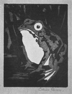
Reproduction of a print in black and green by Lillian Pecary. The original, done on Japanese paper, is 4 1/2 x 3 1/2 inches. A great deal of offsetting has to be done in working up a four- or five-color job. Blocks 1, 2, and 3 may need to be offset on No. 4 in order to secure proper relationships. It is quite simple after a little practice.
For offset work select a paper that is not too absorbent. A sheet torn from your daily newspaper is very satisfactory. Enough pigment must be left on the paper surface to insure a good offset on the wood or linoleum. It is a good idea to use an ink with considerable mixing white in it. To be sure, a light color will not show up as well on the virgin blocks but it will be very "tacky". Dust powdered charcoal on the offset and spread it over the surface. It will stick to the sticky ink. Rub the block hard with the palm of the hand. You will have a black pattern on a dry surface which can be engraved at once. Without the charcoal you would have to wait for the offset to dry.
If your original drawing is in charcoal or soft pencil you can offset it directly to the first block by putting the block in the press in contact with the drawing. Usually a good offset can be secured in this manner, though much depends on the surface of the block. If it is as smooth as a piece of glass, perfect results may be expected.
A drawing made upon paper with waterproof India ink can be offset to the block by the following process. In the first place the drawing should be on thin paper. Cut a piece of blotting paper slightly larger than the drawing an lay it down on a folded newspaper or a magazine. Saturate the blotter with household ammonia by pouring the liquid directly from the bottle. Lay the drawing upon the wet blotter, inked side up, and press it gently into contact with the blotter until it becomes saturated and lies flat on the blotter. Next, place the linoleum block, face down, on the drawing, and put the newspaper with drawing and block under the press. Apply considerable pressure. The drawing is by this means offset upon the block and it appears in reverse. The print will therefore face the same way as the original drawing. The kind of paper and ink used - India inks vary slightly in composition - influences the length of time needed under the press. One minute may suffice, fifteen or more may be required.
At times, the transferring process can be avoided altogether by direct drawing upon the block, whether wood or linoleum. After the design has been studied in preliminary sketches, the final drawing may as well be made upon the block itself. Perhaps it is not generally realized that it is as simple to do this as to make the final study on paper with the idea of transferring it. India ink, charcoal, and pencil can all be used for drawing directly upon the block.
India ink is perhaps the best medium for this purpose. To prevent the ink from "crawling" when brushed upon a linoleum block, first was the block with household ammonia. Ink drawings may be corrected very easily by scraping with a sharp knife or a razor blade; these scraping tools take the place of the eraser.
I have already explained how we usually engrave our blocks in such a way that certain areas of the picture will receive color from more than one block. The following diagrams describe this procedure. In order to illustrate how this works out in actual print design I shall demonstrate my method by plotting blocks for a print which might be made from a little watercolor sketch although it was not intended to serve as a print subject.
It should be noted that the design might be plotted in several different ways and that more than three blocks might well be desired. Three blocks probably would suffice, though I'm not at all certain. Possibly after the blocks were cut and trial proofs made I might want to add a fourth or a fifth. But these three will do for the purpose of demonstration.
Number 1 provides for the clouds, the hills, the barn roof and the hay inside the door. It also gives an undercolor for the side boards of the barn. Since the relief areas of the clouds and hills are separated it is a simple matter to treat them with different colors. If desired, a graded tone - suggesting light and shade - can be applied. The hay can easily be given a different color from that of the hill and roof. It would have been feasible to let this block also print an under-color for the foreground, or a part of it.
In number 2 it will be noted that the sky area is left in relief for a "bearer". That will change the color of the cloud by lifting off some pigment. If the small cloud were cut out of this block we would achieve two different cloud colors by this simple device.
Another way to modify the clouds is to leave a bearer to cover the large cloud only (in number 3). Or an additional color might be applied to this cloud shape. If we want a blue sky (where white appears in the sketch) that can be done in block 2 by cutting out both clouds but leaving the sky itself in relief: it is entirely detached from the other relief areas of block 2 and can be easily inked with any color.
The possibilities of color variation in a 3-block design thus
appear to be extensive. When double that number of blocks are
employed, as there were in "Homeward Bound", I used fourteen colors
on those six blocks - the overlays, blendings and gradations of the
colors produce a print as varied in color as though it were painted
with a brush.
There are two possible procedures in printing. Impressions from the first block may be run off to the number of the proposed edition; then the second block given the entire run the next day or at any subsequent time, followed by the remaining blocks each in its turn. This is the traditional Japanese method. The alternate plan is to complete each print before starting another, so that at the end of a day there will be perhaps fifteen finished prints instead of one hundred impressions from the first block - assuming that is the size of the edition. This is the way the Watsons do their printing.
In comparing the two procedures there are a number of factors to be considered. The chief reason we use this latter method is because it offers a greater creative scope in printing. We analyze each print as it is completed and note that by a little different treatment of one or more of the blocks the print might be improved. Perhaps it's just a matter of a dried inking of block 2, or a little more emphasis of the blue on block 4. The succeeding print can thus be enhanced and as each print is completed we can keep a constant check on our inking.
This order of printing means that each impression goes on over the wet imprints of the preceding blocks, hence blends with the under painting in an interesting way. If the first color is permitted to dry before the second is laid on, the quality of the print is quite different. The contours are sharper and there is less integration of the pigments. This, I should say, is neither a better or less desirable effect: it is wholly a matter of the artist's own preference in his own work. It makes a difference of course whether the medium is watercolor and rice paste - the Japanese medium - or the oil technique that we employ.
Paper, it seems, is of surprising importance in printing. We favor a very absorbent Japanese paper called "Goyu" which, before the war, could be secured from the Stevens-Nelson Paper Company of New York. This paper, made from a plant fibre, drinks in as many impressions as would ever be planned for a color woodcut.
Ernest W. Watson, 1945