 HE
printing press is considered such an important part of modern
civilization that it is hard to imagine the time when the world not
only dispensed with its blessings entirely, but managed somehow to
get along fairly well. It was especially tough on the sports since
there were no newspapers to picture the golfers in proper stances and
the Helens knocking smoking ones across. Before the printing press
there were really no machines and consequently no unemployment
problems; no time-saving devices and consequently plenty of time.
Everything had to be done patiently by hand, from building the
magnificent cathedrals to decorating weapons and the tools of daily
life; in wonderful carvings, from such domestic utilities as cake
moulds to pulpits and choir stalls. Books were hand-lettered by
scribes and decorated by illuminators of marvellous ability.
HE
printing press is considered such an important part of modern
civilization that it is hard to imagine the time when the world not
only dispensed with its blessings entirely, but managed somehow to
get along fairly well. It was especially tough on the sports since
there were no newspapers to picture the golfers in proper stances and
the Helens knocking smoking ones across. Before the printing press
there were really no machines and consequently no unemployment
problems; no time-saving devices and consequently plenty of time.
Everything had to be done patiently by hand, from building the
magnificent cathedrals to decorating weapons and the tools of daily
life; in wonderful carvings, from such domestic utilities as cake
moulds to pulpits and choir stalls. Books were hand-lettered by
scribes and decorated by illuminators of marvellous ability.
The influences of the various crafts carried on for years after machinery came into use. When books were made by scribes it was unthinkable to make them without ornamentation; that became thinkable only with time-saving machinery. One of the traditions that persisted after the printing press had established its right to existence was the coloring of printed pictures. Early woodcuts were colored by hand, most of them very crudely - the block impression furnishing the pattern to guide the colorist when stencils were not being used. The evils of time-saving quickly become apparent when this work is compared with that of the earlier illuminators.
It was the next logical step to print the colors instead of painting them by hand. The first books printed in Mainz were decorated with initials of red; the Psalter of 1457 had initials of red and blue. To Jost de Necker, a Dutchman, is given the credit for inventing the use of the supplementary blocks to superimpose one color upon another, at Augsburg in 1508. The idea was in common use in various parts of Germany when the Italian, Ugo da Carpi, was granted a copyright for it by the Venetian Senate. The earliest known color-print of the Orient is in a Chinese book dated 1625.
One development in color-printing was piled on the other until the art lost the essential qualities of the woodblock, becoming merely a reproductive medium for paintings. The Japanese kept the process pure from the time of its introduction into the country in the early part of the eighteenth century, and under continual development until its decline sixty or seventy years ago. They did not have to contend with the newer inventions of other graphic processes, which always tended to become entangled with older existing ones. In the Japanese work there was the same division of labor that prevailed during the life of the woodcut before the artists adopted it for their own. Perhaps in so involved a method as theirs the procedure was salutary. Once the artist finished the drawing or painting he was through with it; he did not even have to sign the prints and he could proceed with the next creation. The separation of colors and the cutting of perhaps fifteen blocks for the various colors and combinations of color was left to the block cutter, and the long ordeal of printing to the printer. For the artist to have done otherwise would have left him very little time for anything else but the mechanics of the art.
A number of modern artists are making elaborately colored prints, doing all the work themselves. So far, none of them have produced anything like the effects got by the Japanese combination of artist, cutter and printer, nor have their prints the aesthetic content of the artists who have worked in monochrome.
Some charming effects are secured in modern color-prints, but speaking in general, the intangible thing that makes Art is more likely to have been eluded; the creative spirit seems to thin out more with every additional color. One imposes more severe limitations on one-self when using black and white only, but the fact that the medium is less involved in the matter of the mechanics permits more effort to be concentrated in actual creation.
The simplest color-print is that known as chiaroscuro, and it consists of but the one supplementary printing block beside the one having the picture to be supplemented, known as the key block. Depending on whether you wish to make use of one or a dozen other colors, one or a dozen impressions from the key block are transferred or offset to clean blocks. Theoretically every color will require a separate block, but sometimes two colors can be applied on the one block without intermixing, and printed at one operation.
If the printing is going to be done by hand, that
is by burnishing instead of on a hand-press, the block must be larger
to allow for the guide or registering notches. These notches must be
placed in exactly the same relation to the key block in all the color
blocks. So, before you start on the key block allow for the margin of
the print. If a two inch margin, add at least two and one half inches
to the width and length of the block. Then cut the guide notches as
shown in Fig. 23. 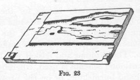 You
proceed as with any woodcut - making due allowances for the effects
of the tints. Now you take another block of the same size as the
first and prepare it for an impression as you would any block for a
drawing - allowing two and one half inches on the same side and
bottom of the block. A heavily charged impression is then made from
the key block, using the guide notches for the sheet, and it is laid
above the clean block in the same relation as in the key block - that
is, allowing one half inch for the side and bottom notches. The print
is then impressed or offset, as printers say, on the clean block. The
edges of the sheet where they were guided on the key block are
carefully indicated on the clean block with a knife or pencil. Or,
better, you can cut the guide notches in the second block before
offsetting and use them when you offset. Then the print is removed
from the block and the important lines on the transferred impression
strengthened with pen and ink. The impression will rub off rather
easily even when dry. If but a few high lights are to be indicated
they may be cut at once. If much cutting is to be done on the block
the areas or lines to be printed ought to be inked with a pen, thus
making mistakes less possible by cutting into areas to be retained
for the color. Then the borders are cut away, favoring the inside of
the black or dark lines and areas, as the black or dark key
impression will cover the lighter tint.
You
proceed as with any woodcut - making due allowances for the effects
of the tints. Now you take another block of the same size as the
first and prepare it for an impression as you would any block for a
drawing - allowing two and one half inches on the same side and
bottom of the block. A heavily charged impression is then made from
the key block, using the guide notches for the sheet, and it is laid
above the clean block in the same relation as in the key block - that
is, allowing one half inch for the side and bottom notches. The print
is then impressed or offset, as printers say, on the clean block. The
edges of the sheet where they were guided on the key block are
carefully indicated on the clean block with a knife or pencil. Or,
better, you can cut the guide notches in the second block before
offsetting and use them when you offset. Then the print is removed
from the block and the important lines on the transferred impression
strengthened with pen and ink. The impression will rub off rather
easily even when dry. If but a few high lights are to be indicated
they may be cut at once. If much cutting is to be done on the block
the areas or lines to be printed ought to be inked with a pen, thus
making mistakes less possible by cutting into areas to be retained
for the color. Then the borders are cut away, favoring the inside of
the black or dark lines and areas, as the black or dark key
impression will cover the lighter tint.
If the blocks are of the same size and square on two adjoining sides, and yet not large enough to include the guide notches, and are to be printed on a press, another method for offsetting may be used to get the second cut in the same relation on the block as the first one. The tympan and frisket are removed from the press. Put the sheet of paper on the bed of the press and the heavily inked block above it, face down. Run a pencil line along the two square sides of it. Then make the impression. Immediately place the clean block within the pencil lines and impress again - thus offsetting to the second block. Another way is to wedge the key block against a right angle - like the corner of a chase. Ink it heavily and place a sheet of paper above it. Hinge this down with a paster or stickum of some kind. The impression is made, and immediately the new block is substituted in the same place, without removing the impression from its hinge, and the impression transferred to the new block.
When using color inks mix the tints on the ink slab with a palette knife. You cannot mix with the roller. Remember to start with the lightest color of the combination, as the base, and add the darker. It takes very little of a dark color to change a light one, but a great deal of the light to change a dark one.
The general practice is to print the tint or tints first; to suggest otherwise to the average commercial printer will lead to heated argument. And yet better results may be obtained if the black is printed first, provided the tint is a transparent one. The black, or dark, being the 'key' color is the more important, and it is better to get that impression clean. The black over the tint is very apt to shine and 'wipe' - somewhat like printing on a greasy surface. Another advantage to the print-maker is that the tint may be printed directly over the black without waiting for the first impression to dry. A little magnesia powder dusted over it before the second impression is an advantage. The black or dark ink should be stiff and opaque and the tint transparent. With more than one tint a clean black may be dimmed or muddied where the tints are super-imposed on it. If the tints are opaque the black impression is bound to suffer. Burnt sienna, raw sienna and milori blue are transparent as well as the alumina hydrate white used in lightening these colors.
If more than one tint is being used, beside the key black, the same process is used to get the relation of paper to the block on all the blocks, for each color. You can superimpose one color upon another. For example, a brown tint for the supplementary block and a blue for the key block may be used, the combination of which will make a black, and give the effect of three colors. If the colors are to be kept separate instead of being superimposed, it is necessary to have good registration and clean meeting of the color areas. As more colors are used the combinations become complicated - unless all the colors are to be kept separate from each other.
In making the supplementary blocks for the tints there is no crying necessity to have all the tints on the same size blocks, and the design in the same relation to the edges of the blocks, when the printing is to be done on a press, but it does make things simpler to have the blocks so. The tympan and frisket will have to be worked unless the first mentioned scheme is used, whereby the block can be printed either by hand-burnishing, or on the press with the tympan and frisket removed. Registration notches are not needed on the block when the tympan is used. In this case to save time and trouble of getting registration for proofing, an impression may be made on a sheet of cellophane, and by placing it above the black or key impression an idea can be had of how it will look and fit.
I have assumed in this chapter that oil inks and a press were to be used. In burnishing, especially without the beeswaxed sheet, the paper is apt to get distorted. In offsetting with the burnished print some inaccuracies are bound to creep in. Perhaps, if the tint block is to be a simple one, it would be better, lacking a press, to fall back on a tracing with which to make the tint design.
Permanence of color is a necessary consideration. There is not much danger of colors fading when prints are kept in a cabinet or portfolio, but the danger of chemical action is ever present.
If you are thinking of using the Japanese method of color-printing - that is, the use of rice paste and color painted, so to speak, on the blocks, and printing with the baren (a burnisher in which the active agent is the veins of the palm leaf) that is another matter. The pamphlet issued by the National Museum of Washington and long out of print, but which may be accessible at some libraries, tells the story completely. There is a manual by Mr. Fletcher, mentioned in the bibliography at the end of this book, which also gives all the particulars. I have never tried the scheme, harboring perhaps mistakenly, the notion that the process is too indigenous to Japan to be successfully exploited by an Occidental. I have never seen any paste color-prints by Western artists that compared to Japanese prints. But there may be an embryo Hiroshige in the West; I should not want to discourage him.